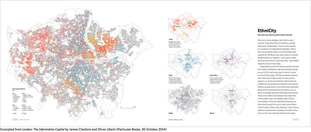
This isn’t a colour blindness test. But in a way it could be. Using data from the 2011 Census, we have counted the number of people per self-reported ethnic group across 25,270 small areas. We then scattered coloured dots within each of these areas for every twenty people or so of the same ethnicity. Places with lots of different coloured dots are therefore more diverse.
Please visit London the Information City for the full size infographic and details of the book that it was taken from – http://theinformationcapital.com/project/ethnicity/
